|
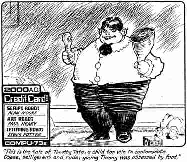
The Pitch
Dreddcon:1. London, November 2000. Forget Mean Arena, forget Strontium
Dog: The Killing, there is no more terrifying contest than Tharg's
Pitch Fest! To stand alone
on stage, in a large room full of people staring at you and three
of 2000AD's top droids taking notes sounded nightmarish. What could
make this torture worthwhile? The chance to leapfrog the submissions
pile and pitch your best story directly to Tharg. The glittering first
prize, a Future Shock in the Galaxy's Greatest Comic.
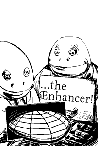
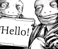
As someone with worse public-speaking skills than George
W Bush, I took the precaution of roping Pete into presenting the two-minute
story pitch (he co-wrote it, after all). He would bear the scrutiny
of the audience, while I cowered next to him behind some very large
drawings [left].
I was still almost sick with nerves but Pete delivered
the rhyming couplets of our pitch superbly, and at exactly two minutes.
The audience was appreciative, but what would Andy Diggle, Robbie
Morrison and Frazer Irving make of it? I don't know. All I remember
is a desperate urge to return to my seat. I'm afraid the combined
wisdom of three comics professionals went in one ear and out the other.
In the end, we shared first prize with a young writer called Si Spurrier
(and I will be reminding people of this when Si goes on to revolutionize
comics and writes the next Maus or Watchmen).
The script
So we were going to be in 2000AD. First we had to turn the two minute
outline into a script. Luckily Andy Diggle was patient and gave us
valuable feedback on our first attempt. A rewrite later and it was
done. But then, for me, the best bit came when Tharg let me draw it!
This was never part of the Pitch Fest arrangement, but I had hoped
it would happen. You have to realize I started reading 2000AD aged
9 and it's one of the main reasons why I went into a career of illustration.
Being commissioned to draw a strip for 2000Ad was, in my book, a Very
Good Thing.
|
|
Artwork
For comics, I tend to jot down key images as thumbnails and then start
to lay out the text. For me, the dialogue and captions are worth sorting
out early on because they have such a strong effect on the page design.
Not only do they determine how much space is available for the images,
but they also guide the reader's eye across the panels. Once I know
what space I have to play with for the art, I go back to the images
and establish the best point of view for each panel. Combining the
text and images helps to determine the shapes of the panels and the
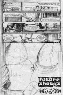
look of the overall page. For this strip I used a 6 x 9 panel grid
as the basis for the panel layout, with the most important panel of
each page breaking out of the grid. By restricting the number of different
shaped panels used, I hoped the layout would distract less from the
story. In the case of page 1, I wanted panel 5 as big as possible
for maximum impact, so the first four panels were just 6x1 grid squares
each and the fifth panel is a full page bleed.
Because the Enhancer device in the story allowed the
user to navigate in 3D space inside a 2D image, I had to make the
space depicted in my artwork as consistent as possible. I took the
unusual step of building every scene in a 3D application, which allowed
me to move the camera around the figures until it matched the point
of view of each rough panel.

I inked directly over the figures using Flash, a vector-based
drawing application. Vectors give lovely crisp strokes and I find
Flash to be the most intuitive drawing tool. The only drawback is
you can zoom in again and again without losing quality so it's easy
to spend an hour drawing a detail so small it's invisible to the naked
eye!
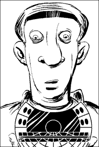
And that's how it was done, including enough late nights
on the computer to make me think I was turning into poor old Dave
from the story!
|
![]() Judge Dredd and 2000 AD © Rebellion A/S 2008.
Judge Dredd and 2000 AD © Rebellion A/S 2008.