 |
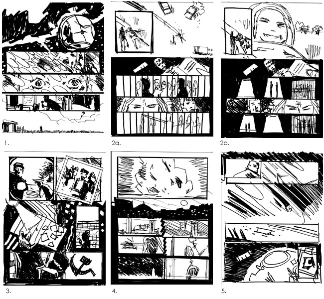
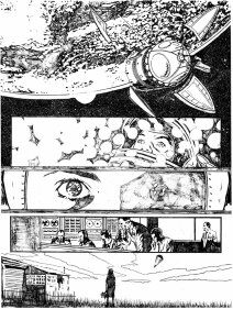
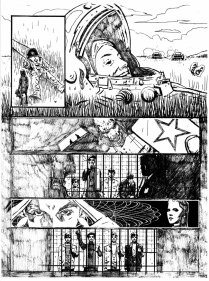
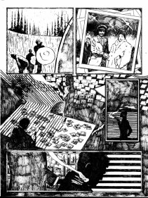
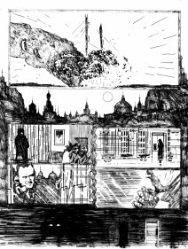
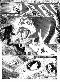
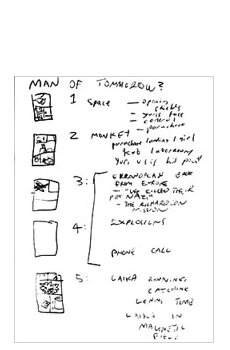
COSMONAUT - BEHIND THE SCENESTHE SCRIPTCosmonaut X started as my entry to the Dreddcon IIIs Pitchfest - the annual opportunity to pitch a story to 2000ad in front of editors, experienced pros and an audience of fans. It was based on a fairly simple premise: - what if space really was full of weird transforming radiation, like in the Fantastic Four, what would the effect have been on the early Russian astronauts and test animals they sent up? And if this gave them some advantage over the Americans what would they have done to hang onto it? It was a hook the audience seemed to respond to, especially the scene where an escaped space-chimp grows to an enormous size and begin climbing a Stalinist-gothic skyscraper like some Soviet version of King Kong, and ended up being the winner. The script was written over Christmas 2002, despite a stinking cold. I Already had the key events of the story as bullet points from the pitch, I then begun drawing it out as thumbnails - which with me means a bunch of incomprehensible little squares with wiggly lines representing various things. It's not a representation of how I want the final layout of the comic to look - I'd found with my small press work that you're best off leaving that to the artist - so much as a way of sorting out in my head the order of the panels and what goes on which page. I then began work on the actual script itself, returning to my doodles ever so often when I got stuck or bored. I submitted the script to Matt Smith who accepted it with one proviso - the monkey scene had to go, as it didn't really fit in with the now more sober tone of the piece, and detracted from the surprise of the climax. It was a hard cut to make, but ultimately the right decision, especially as it would have left the second page horribly crowded. Also I'd learnt from my research that, rather inconveniently, the Soviets had never actually sent any chimps into space. The scene with the beatniks replaces it. THE ARTI didn't hear anything more about the progress of Cosmonaut X until that years' Bristol Comics festival, where I met with Laurence Campbell, who'd been given the job of drawing the artwork for it. We'd met briefly before at Dreddcon and so recognised each other, and took the opportunity to discuss the project. It turned out that Cosmonaut X had been delayed as he was working on Synammon - which I saw some pencils for and got quite excited: I'd wanted a very 60's look for Cosmonaut X - I was thinking particularly of Jack Kirby, but of 60's-style comicbook art in general - and Laurence's latest work seemed stylistically influenced by Jim Steranko, one of the great 60's comics artists, a perfect fit. We exchanged emails and I sent what must have been an absolutely terrifying amount of Russian reference material, from obscure websites to my own holiday snaps. It may have been over the top for such a small project but Laurence seemed to share my enthusiasm for it. A few months later we met to discuss the first set of roughs, seen here. There are two versions of page 2 which we used to discuss various layout possibilities and ideas. We also spent a little time discussing the first panel, and eventually settled on having the Vostok smaller in the panel to emphasis the space around it and show off the curve of the earth. |
![]() Judge Dredd and 2000 AD © Rebellion A/S 2008.
Judge Dredd and 2000 AD © Rebellion A/S 2008.
BARNEY is a fan site by
based on 2000 AD Online 2001-2008.

